5 Important Things that Every Website Should Have

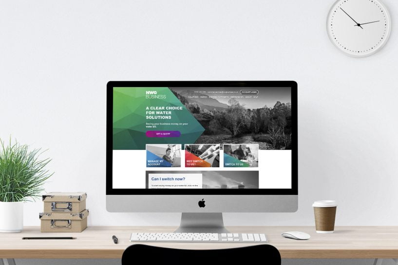
A lot of businesses don’t recognize just how important a website is in developing their marketing strategy. It is important to ensure that all the necessary elements are included into any website design before it is released for the first time. If you’re thinking of getting a website redesign or asking how to generate more leads for your business, it’s a perfect idea to start with your homepage. Rather than treating it as something built around one particular action, it should be designed to serve different audiences with different expectations. In other words, you need to incorporate elements that attract traffic, educate visitors and bring conversions in.
When building a website, small business owners tend to concentrate on one particular thing that makes a good website. Of course, each website has unique qualities, but there are various factors that make a great business website. If you think that your website is outdated, then it’s time to start working on your website so you can promote your business and take advantage of the online market.
Mobile Friendly Design
It can’t be emphasized enough that a good website should be mobile responsive. You want your website visitors to be able to have a great user experience on your website from any devices like a phone, tablet, or desktop. The best way to achieve this is creating a responsive mobile design where all the design elements will respond effectively to any size of mobile device.
Searching on a small mobile phone or tablet is a very different experience than that of a desktop, so it is essential to update your website for the majority of your mobile visitors. Despite how important this is, a lot of small business websites are still not mobile compatible according to a study. Most of your online traffic will come from people who use mobile devices. Because of this, it’s absolutely important that your website looks good and functions well on mobile devices.

Good Website Navigation
Going into a new city would be difficult to find your way around the area. It would be possible and quite frustrating. This is the same for someone who arrives at a website that has bad website navigation. If your visitors can’t find what they are looking for, they will leave immediately. Your website navigation should be easy to use and understand for a lot of your first-time visitors. You want someone to appear on your website and know precisely where to find the information they need without being worried.
If they find their way around your website, this could potentially make or break not only your website’s reputation but also your business name in particular. Having an easy to read and understandable navigation is one way of getting any website. If you’re not making it clear and simple for your visitors, chances are they aren’t going to stick around for so long.

Clear Call to Action
Every good website should have specifically placed call to actions. Basically, what do you want people to do when they are finished looking at a particular section or page of your website? When someone lands on your website, it should be clear enough on what action you want them to take next.
On your homepage, you can go with options such as subscribing or requesting a free consultation. Talk with your team and decide on what call to actions you really want people to do when they arrive on your website. But be careful as having a various call to action will only confuse your visitor and ruin a potential buyer’s journey.

High-Quality Images
Include great quality photos as part of your website design and at the same time, help break up the flatness of just having plain text. Provide a visually appealing experience for your website visitors. Take note that while almost everyone can take good photos, not everyone has the skill in determining what makes a photo great.
Using stock images are quite convenient, but they won’t build credibility for your company or engage your audience thoroughly. The same for low-resolution or small images. Use real photos of your company and the team on your homepage as this will provide a realistic representation of what people can expect when buying from you. In fact, having high-quality images show professionalism and trustworthiness. Photos are one of the easiest ways to capture a visitor’s attention. Ensure that all the images have been accurately resized to load correctly on any device.

Visible Contact Info
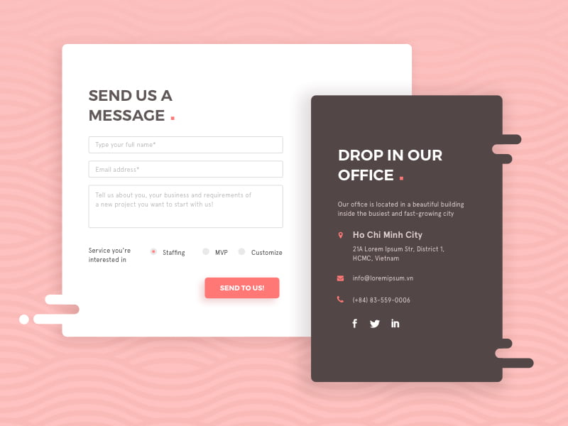
People are now suspicious about buying online if a website or company has an incomplete set of contact details. It should always include at least a contact number, physical address, one email address, especially if physical products are being shipped to different locations.
Your contact information should be easily seen on your homepage. Most contact info is commonly found in the footer, which includes an email address, location and phone number in case someone wants to contact you directly. Having the necessary information readily available offers comfort by letting people know that they can contact you if they need to. Also, a contact info adds a sense of credibility, making it clear that your website is a legitimate business.

Considering a Website Design?
We create incredible websites for each of our clients and we keep designing until the customer is completely satisfied. By understanding how customers use your website and what they’re searching for, we always deliver an outstanding user experience. Every project we have, regardless of size, is researched thoroughly and we only start designing once we have the necessary information available. We also work in small teams where you can have access to a designer, a developer and a marketing specialist at every stage of the project. We love creating beautiful website designs, but what really motivates us is developing an outstanding customer journey. Our team will continuously create responsive web designs where it responds effectively and correctly to any device.
Recommendations


Leave A Comment