Here’s What Design in 2020 Will Look Like

As 2020 rolls in, there’s fresh anticipation for what design would look like especially for us who live and breathe marketing and advertising. What will my clients want this time? What is something new that we can bring to the table? What are we willing to adapt to make our brand as fresh as it can be without losing our integrity? These are all valid questions. Lucky for us, design in 2020 looks to be a significant revamp and upgrade to the trends we saw in 2019.
Various design firms offered their predictions for how design in 2020 will look like and how it could have that lasting effect on pop culture (via CreativeBloq). Call us pandering excited, but we see designs filled with overwhelming color and beauty this year.
GIFs will rule the world

GIFs will step up from being a mere tool in the meme culture to a significant element in design. They’re all over Twitter most of the time, but design in 2020 might see more of these bumper-like images all over marketing and branding strategies. StormBrands’ executive creative director Mark Chatelier believes that the use of GIFs will revolutionize the digital imaging industry. “We’re seeing more brands use GIFs to offer quick and quirky responses to notable events throughout the year: look at Google’s mini Twitter animation for Movember for example,” Chatelier says. “Think storytelling, dynamic use of identity and content, animated mascots and brand assets that move and interact with each other across websites and social media. Designers can no longer afford to sit still. It’s time for brands to follow and explore how the popularity of the updated GIF format can work for them. Otherwise, it’s an opportunity wasted.”
Typography: A Better Branding Statement
One of our favorite brands when it comes to minimalist typography aesthetics is Loblaw Companies’ “Noname” brand. Black and yellow. It’s as simple as that. They don’t have a flashy logo nor a striking mascot to identify their brand. All it takes is for you to see two colors and a Helvetica Neue Bold font (set to about 50% kerning) to identify them for who they are. Oddly enough, it sticks.

Incidentally, designers feel that 2020 will see the rise of text-only branding. Crello’s Head of Project Nazar Begen notes that “designers are playing with typography more than ever, to create more innovative and modern compositions. Artistic typography, maxi typography split into multiple lines, and semi-transparent fonts forming various shapes are all on the rise.” Fat Cow Media’s Steve Sharp also agrees that simple and bold typography will muster up all the hype for design in 2020. We’re finding this technique to be extremely effective, helping brands to deliver messages via simple, strong, singular statements,” says Sharp. “It’s a good technique for brands that are straight-talking and to-the-point.”
Decluttered and Intentional Clutter
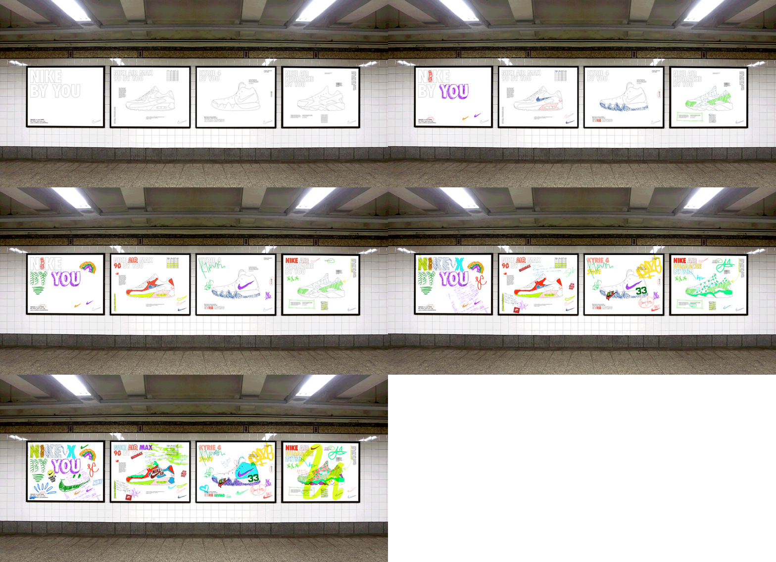
Minimalism continues to be one of the top design trends that we’ll see for years to come (more on that later), but a counterculture-ish aesthetic is also seen to gain significant attention. Creative Bloq describes this as the “super-maximalist” and “ultra-minimalist” aesthetic.

Gretel’s Justin Au saw these two design movements gather up steam in 2019, and he believes that it will continue well into the throes of 2020. “On the one hand you have a super-maximalist approach, filled with exuberant letterforms, 3D distortion, and alternate methods of image-making such as acid graphics or collage,” Au says. “On the other hand, there’s a return to an ultra-minimal editorial approach, driven by tiny typographic nuances and a dedication to presentation by stripping all excess. You can see an example of that in our design system for WeWork. I think both are successful in cutting through the blandness of clean, geometric sans-serifs that have dominated subway walls and Instagram feeds alike.”

3D Renders and Vibrant Colors
Flat designs have been all the rage over the last six years. Social media platforms were quick to adapt to the change by altering their icons to fit the aesthetic. Soon enough, most web and poster designs featured an animated flat design. This year, though, 3D art will retake its throne through a fresh, new perspective on the art of 3D rendering.
Consuela Onighi, a UX designer at Illustrate Digital, believes that 3D art has encountered some type of renaissance for it to be recognized as another form of modern art once again. “I’ve noticed that over the past few months, most designs have created a 3D feel by combining layers of typography, images, and abstract shapes, often reflective of the company branding, to create depth,” Onighi says. “This is often paired with bright, vibrant colors and gradients, which I believe will become a strong trend in the next year too.”
Meanwhile, in terms of color, Alex Halfpenny of Elmwood expects vibrant and neon colors to take over the main color palette of design in 2020. Neons, fluorescents and bright vibrant colors continue to be the go-to for designers to help design stand out,” Halfpenny says. “Favouring digital application, or special print colors, the addition of subtle gradients help colors feel alive, and give design a youthful and future-facing, optimistic aesthetic.”
Minimalism Intensified
As many people switch to a more conscious and intentional lifestyle, so does design in 2020. We started dabbling in minimalist design in 2012 and continue to do so now more than ever. The last six years also featured the minimalist design trend (at least, in software and UI design), and it’s showing no signs of slowing down. Grady Britton group creative director Brian Dixon stresses the need for minimalist design for brands in 2020. “In line with marketing’s ongoing quest for transparency and honesty, design will continue to strip away extra flair and embellishment and move toward a much simpler, straightforward presentation,” says Dixon. “It may even veer into intentionally unfinished at times, as believability is the priority.”

Designer Paul Levy also supports Dixon’s belief about minimalist design. “The ubiquity of flat design, involving primary colors, simple, intuitive two-dimensional illustrations, and easy-to-read type, will continue to grow,” he predicts. “The main benefit of flat design is in allowing users to quickly interact with interfaces, and find the content they’re looking for.”
Recommendations


Leave A Comment